Pinterest has revealed its 2026 Pinterest Palette™, a data-driven forecast of five colours expected to shape visual trends across design, fashion, interiors and branding this year. These shades – Cool Blue, Jade, Plum Noir, Wasabi and Persimmon – are drawn from billions of searches and saves by 600+ million Pinterest users, offering deep insight into what audiences are already planning, pinning and searching for in 2026.
For brands looking to create campaign photography, social content and product imagery that feels on-trend, choosing shoot locations with this palette in mind can make all the difference. Below we explore what each colour represents and match it with a beautifully curated Styled Home Studios location that embodies the same vibe.
Cool Blue – Clarity and Calm
Cool Blue is a serene, glacial-tone shade that reflects clarity, calm and modern simplicity – an uplifting colour forecast to dominate interiors, fashion and creative campaigns this year.
Perfect shoot location:
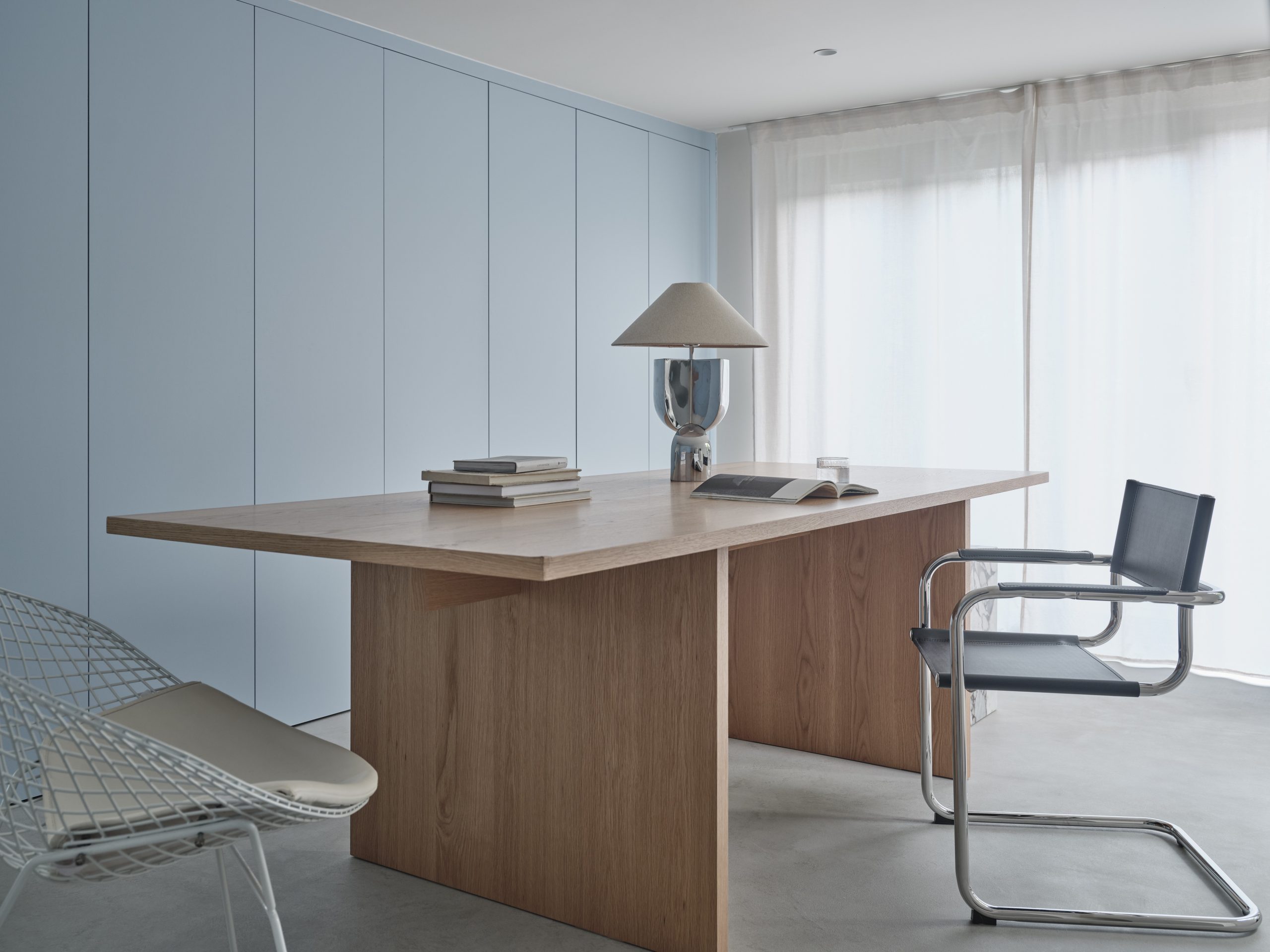
New Minimalism – E4
With its pale, crisp interior palette and minimal, architectural lighting, New Minimalism is a perfect backdrop for campaigns embracing Cool Blue’s sense of clarity and calm. Soft daylight, clean surfaces and a subtle aesthetic help the colour breathe – ideal for product stories, lifestyle editorials or fashion imagery that wants to feel fresh yet composed.
Creative tip: use Cool Blue accessories, textiles or props against neutral backdrops to let this calming shade stand out.
Jade – Grounded, Earthy Elegance
Jade sits somewhere between mint and moss, balancing freshness with earthy sophistication. This colour reflects a broader interest in biophilic design — connecting interiors with nature and emotional wellbeing.
Perfect shoot location:
The Secret Garden – KT22
The Secret Garden is all about lush green surroundings and organic tones, making it the ideal match for Jade-inspired campaigns. Whether you’re styling kitchen scenes, wellness moments, or lifestyle content with natural flourishes, this space enhances the fresh, grounded energy of Jade.
Creative tip: integrate plants, wooden textures and warm metallics to amplify this earthy colour story.
Plum Noir – Depth and Drama
Plum Noir is a rich, moody shade blending elements of deep purple and burgundy – perfect for visuals that want a touch of luxurious depth and expressive charm. Searches for deeper hues have surged, showing strong interest in drama-led interior and fashion palettes.
Perfect shoot location:
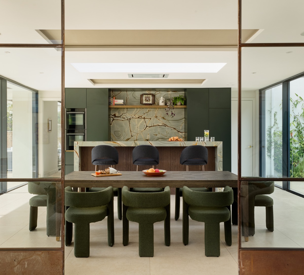
Bountiful Bohemian North – E8
Bountiful Bohemian North brings texture, pattern and artistic interest to life – a space where the richness of Plum Noir can shine. Its layered interiors and artistic sensibility make it perfect for editorial fashion shots, beauty campaigns or product launches that demand character and emotional resonance.
Creative tip: highlight rich fabrics and accents against darker backdrops to let Plum Noir stand centre stage.
Wasabi – Bold Energy and Expression
Wasabi is an electric, chartreuse-leaning green that brings bold defiance and high-energy creativity to the palette. It’s a shade that energises visuals and signals adventurous, expressive design.
Perfect shoot location:
The Lime Kitchen House – W12
The Lime Kitchen House is a playful, brightly curated interior that works beautifully with the vibrant energy of Wasabi. Whether you’re shooting lifestyle content, playful kitchen stories or expressive product visuals, this location brings bold colour narratives to life.
Creative tip: use Wasabi as an unexpected accent – think bold accessories, neon props, or pops of green against neutral backgrounds.

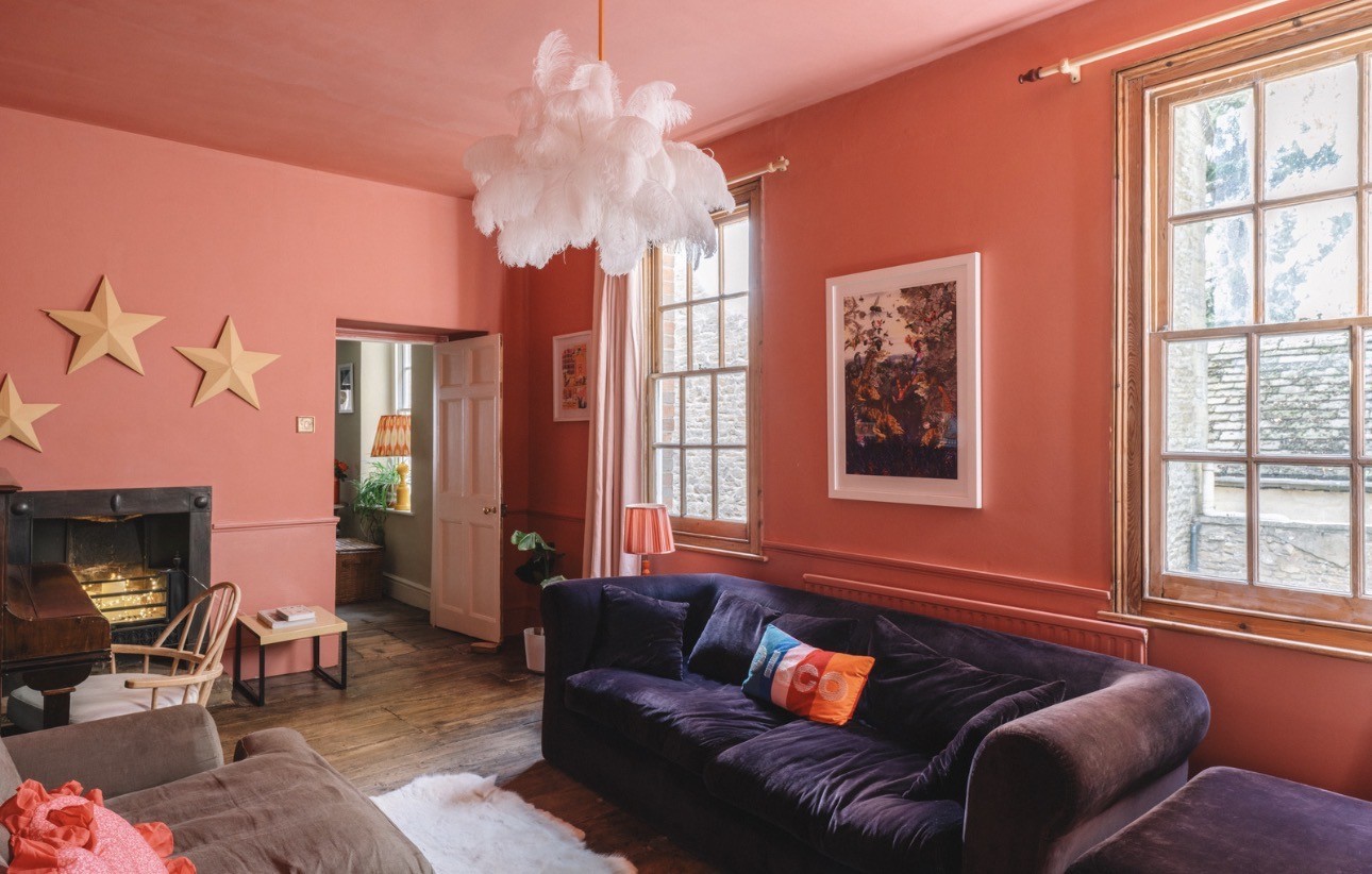
Persimmon – Warmth and Vibrant Joy
Persimmon is a punchy red-orange tone that signals unfiltered joy, bright expression and feel-good energy – a shade driven by audience desire for visuals that spark optimism and warmth.
Perfect shoot location:
The Wine Merchant’s House – OX7
The Wine Merchant’s House is rich with character, textured finishes and warm lighting – the perfect complement to Persimmon’s vibrant warmth. Whether you’re capturing lifestyle scenes, seasonal campaigns or heritage storytelling, this space helps bring that joyful tone to life with depth and personality.
Creative tip: pair Persimmon with natural wood, brass elements or terracotta props to enrich the overall palette.
How To Use the Pinterest Palette in Your Creative Work
Colour isn’t just decorative – it’s a strategic creative lever. Pinterest’s 2026 palette is based on billions of search and engagement trends, meaning these colours are not just pretty – they are predictive of what audiences will be drawn to across platforms, categories and mediums.
When you match the right colour direction with a shoot location that embodies that energy, your campaign visuals feel considered and distinguished. Try these tips:
Colour accents first: Start with accessories, textiles or key props in the trend colour to test visual resonance.
Layer emotion: Combine key tones from the palette to echo mood – for example, Cool Blue + Wasabi for calm with edge.
Environment supports story: Let the location complement your colour narrative rather than compete with it.
Final Thoughts
The Pinterest Palette 2026 is more than a colour forecast – it’s a creative compass for brands and creators entering the year with intention. By pairing these trending hues with inspiring, design-led locations, you give your visuals a powerful edge that resonates with style and cultural momentum.
Thinking about a campaign that leans into one of these colours? Explore the Styled Home Studios portfolio by colour – and bring 2026 colour trends to life with spaces that feel as intentional as your creative vision.